I’m not sure of what the best word is to describe the theme of this week’s Agilebase release.
It’s taking existing features and user interface components and making them available in a wider variety of contexts.
In short, fleshing out the user interface capabilities and making the platform more rounded.
Not being able to concisely summarise, I’ll just describe the specifics.
The two major updates are:
Using a calendar in a tab
The calendar tile of Agilebase is often seen as the counterpart of any other calendar app such as Google Calendar for example. It displays all your diary entries full screen.
However, a calendar interface is also really useful for managing certain types of data as part of a business process, for example organising a rota of multiple staff doing different jobs in different locations.
To do that, you can now display any data in a tab, not just as a list, but in calendar format. Furthermore, you can switch between a standard month view, a Gantt style timeline or even a vertical grid of resources (e.g. rooms), where each resource gets a different column.

When in a tab, the events shown are only those which are linked to the parent record, just like a standard view of rows – each row is linked to the main record.
That allows a massive number of events to be sensibly managed, where they would overwhelm the interface if all shown on a standard calendar at once.
To try this out, just take any tab which has one or more date/time fields in its view. Edit the tab and select ‘Calendar’ for the interface style.
We appreciate The EH Group for kindly funding this development.
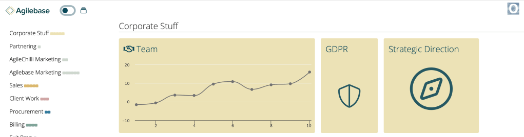
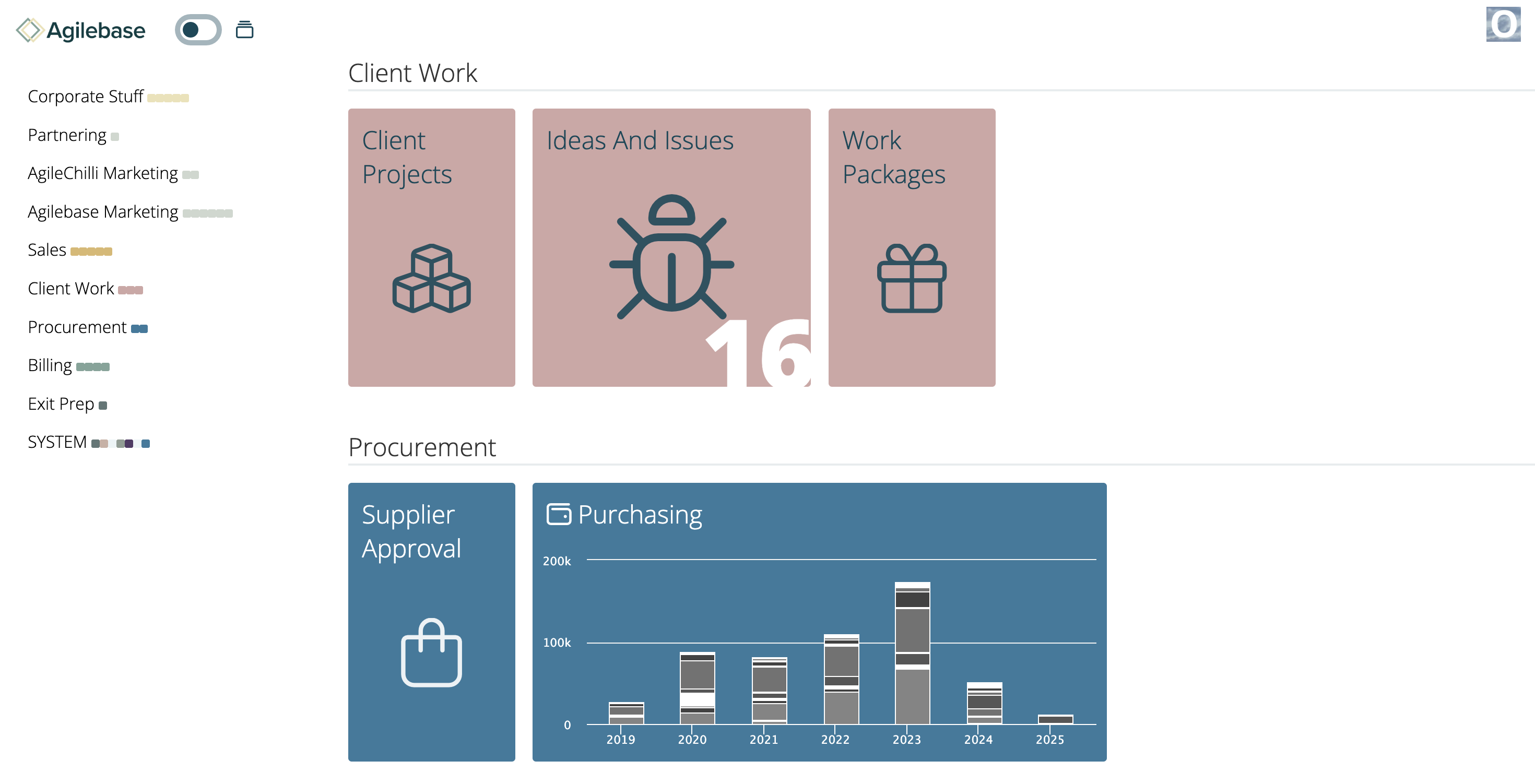
Charts in tiles
Similar to how the calendar interface can now be used in a tab, charts can now be shown in tiles on the homepage. That allows you to see your data immediately upon logging in. For example you could show a set of KPIs.
This is currently a personal choice for each user so you need to enable it for yourself:
Open up a tile, click your user icon at the top right of the screen and select Tile Settings.
You’ll then be able to choose a chart to show in that tile in its condensed form on the homepage.
If you don’t need a full chart, you can also opt in those settings to just show a number, the number of records in a particular view. For example, the number of new items in your task list, or sales enquiries this month.
Here are a couple of examples just so you can see what they look like:

Please do try out both of these new features and let us know what you think, especially if you have ideas for how to improve them.
We look forward to hearing from you.
Coming Soon
In the pipeline are some additional data security protections around deleting data.
In order to delete a record that you yourself didn’t create, you will need to have Two Factor Authentication (2FA) enabled. It’s a good idea for everyone to enable that and hopefully this will further encourage adoption.
In addition, in order to delete many records in one day, you will also need to have a role that allows bulk edits.
That isn’t the case in the current version of Agilebase, but will be in the next.

Leave a comment