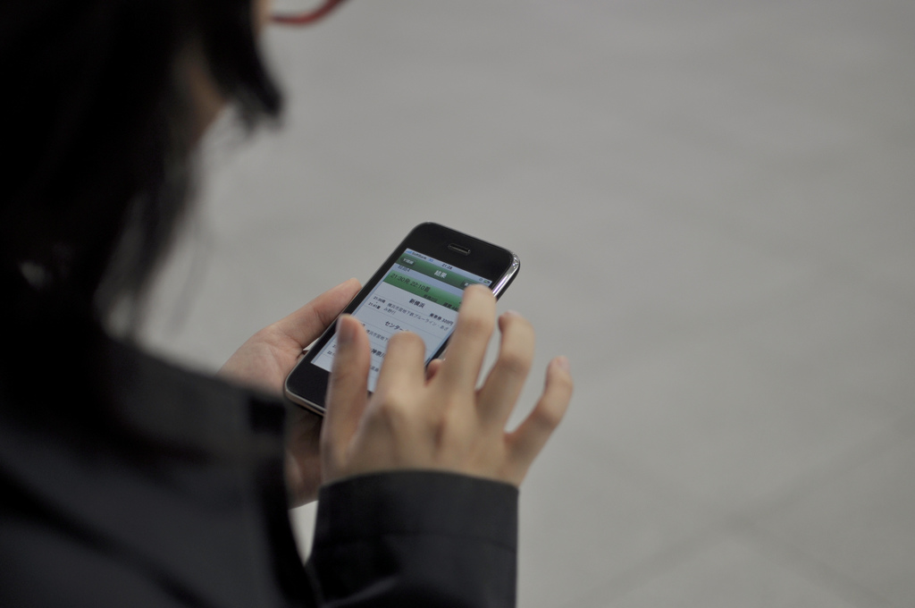
We’re pleased to announce a refresh of the Agilebase user interface for mobile phones and tablets.

The goal is to allow Agilebase developers to create apps for specific purposes which are easy to use on a mobile device. It’s important to note that it’s not to magically make every application built with Agilebase suddenly be just as easy to use on a smartphone. For example, multi-tabbed forms with many data entry fields are always going to be quicker to complete with a full-sized keyboard.
Customers are already finding great uses though, for example quick timesheet entries and completing production line checks in a factory.
If you do sometimes log into Agilebase on a smaller device like a phone, you should immediately see some improvements in three areas:
- The homepage – you now only need to scroll vertically to see all tiles, for a simple intuitive start
- When a tile is opened, the menu at the top has been completely redesigned for mobile, allowing you to easily choose the view you want to see. When using that view, text sizes and other changes mean that it is easier to navigate
- The record editing screen – again, scrolling is reduced, readability is improved, unnecessary elements have been removed and editing behaviours streamlined
plus many other incremental improvements across all three of those screens.
Mobile tips
If you want to design a web app to be usable on a small screen, these few tips are a good start:
- Create tiles and views specifically for mobile use. Ideally a mobile tile will contain only one view, allowing them to get to it from one tap from the homepage
- Make sure that views have the most important fields at the start (on the left) and don’t contain any unnecessary fields, to minimise horizontal scrolling when looking at a view
- Keep data entry forms simple and minimal. If however you want the data gathered to be entered into a more comprehensive data structure, you can create a new table specifically for the mobile data entry and set up workflows to send data to your main tables automatically in the background
Exclusions
Currently only the three areas mentioned – home screen, views and record editing have been optimised. Other interfaces like the calendar, kanban cards interface etc. haven’t. If you want to use those in a mobile-friendly app, please let us know. Note that for calendar entries, you can use the API to sync events with your normal calendar e.g. Outlook or Google, for display on your phone.
Development features also haven’t been worked on, although some of the generic improvements have worked through to those screens as a side-effect of the main work, so in an emergency you should be able to carry out some development tasks.
More coming soon
One more idea from a customer is to allow only specific tiles to be seen on mobile devices. In other words, to remove all the tiles you normally need for your desktop work, leaving only those which are necessary to carry out specific jobs you may want to do on a phone.
Credits
Firstly, thanks to a number of different customers who’ve independently requested this capability, including Neil at Lewis Pies, Alison from Skybound Therapies and Netlet UK holiday homes.
Thanks to the talented Rebecca from Polychromatic web development agency, who planned the whole development, came up with the designs and implemented to make sure everything worked across multiple different screen sizes.
Additional Items
As usual, included in this release are many other miscellaneous platform improvements – here’s a list of those completed recently. Let us know what you’d like to see!
 Platform Updates
Leave a comment